Showing posts with label Mahone Bay Center. Show all posts

Sunday, February 12, 2012

Mono Madness

I've never done monotype, or monoprint, before so when a chance came up for a workshop down at the Mahone Bay Centre with Dan O'Neill, off I went. (For those interested in the difference between monotype and monoprint, here's a brief Wikipedia introduction. To me it's the sort of difference that needs to be drawn for specialists, and pace Heinlein, specialization is for insects.)

Needless to say, it was an enjoyable day. Monotyping seems to pretty much boil down to painting on a printing plate and then running the result through a press so what you get comes out squished and backward, and is a delightful way to make a mess. Good art? Well, I wouldn't qualify my results as such, but there were some really effective pieces produced by others. If photos of those become available I'll put them up. In the meantime, here's mine.

The first was done on a plain plate initially covered in goopy wet black printing ink. It's an exercise in removing the ink and mark making (a phrase that should really be banned for intelligent use). For want of a subject I just played on Dereck who was working at the same table (sorry Dereck!) since he was the sort of person I really enjoy drawing - someone completely absorbed in doing something.


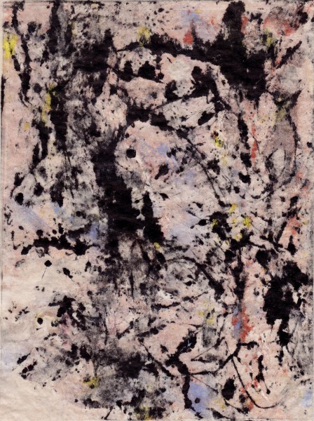
The next was done after a bit of coffee and a break, playing with drips, rollers, scrapers, and various odds and ends. The colour is oil paint and the black is printer's ink. Dan says there's too much black but I think there's just not enough deep red. I think the after effects of reading too much TJ Clark writing about Pollock is apparent.


The next one is sort of cool, it's a ghost print. When the plate is run through the press, most of the ink is transferred from the plate to the paper, but some remains. So you run it through again, using a very fine, dampened, Japanese paper instead of the heavier printing paper, and this is what comes off.


Given a bit of time, one of the great things about printing in general is that the image can be evolved. I love (for example) taking an etching plate, printing a few, re-etching, and doing the same again. More orderly types object to this - they want fixed editions with fixed numbers of runs and things numbered in nice sequences and the plates destroyed afterwards - but as far as I'm concerned, blech. That's for the anti-Darwinists of art. If doing things somewhat haphazardly was good enough for the greats like Rembrandt and Degas, well, who am I to complain.

Monotyping really lends itself to this sort of approach. Take whatever pattern is on the plate and push it around a bit and see what comes out. This idea isn't new - Leonardo suggested taking stains on the wall etc. as starting points. Looking at the previous prints, Arlene saw the random one as more of a landscape when turned sideways, while for me in the orientation given I see more of something figurative. No surprise there, she has a better eye for composition than I do! But as I had the plate and the paints in my mitts (and she was 100 kilometers away), the figure won. Not that that is necessarily a good thing.

Sunday, May 15, 2011

Hanna, Cooked

Well those of you who didn't read the last blog post before Blogger crashed and lost a bunch of stuff on Wednesday won't understand the title! Maybe they'll get it back, but in the meantime, tant pis, and do yer homework, and go practice Satie.

The next picture is of my first semi-decent litho, done Friday and Saturday at the Mahone Bay Arts Centre. Thanks Dan O'Neill for teaching the workshop, and thanks Sally Warren for doing such a great job organizing it.


There are a number of things I would like to change about it, though I like the basic design. For example, I would like to add more weight to the piano and bench so that their solidity would provide a stronger support for Hanna's intensely focussed liveliness. Unfortunately the ball grain aluminum plate lithography doesn't make that sort of change very easy, so perhaps we can redo it in an etching of roughly the same image size. (The image is about 9 1/2 by 12 1/2 inches, this one is done on Rives BFK)

The other current project nearing completion is this one:


There's still work to do on it, but it is coming along. Hanna suggested I strengthen the figures in the background, and add something to do with water, both of which seem to have helped a lot. One of the irritating things about encaustic from the photographic POV (though wonderful from the real life POV) is how variable they are under different light. It varies a lot from one day's photos to the next. I guess if you really want to see what it looks like, you should buy it. Or drop in sometime.

Monday, February 28, 2011

Hanna Prone (and other things)

A great weekend down at the Mahone Bay Center, learning the basics of lithography. Thanks Dan O'Neill (who ran the workshop, and who made an enormously complicated subject comprehensible with a minimum of pain), Ed Porter (who kept things moving), and especially Sally Warren who organized it. As well as the rest of the print group there, who were very generous to a Halifax based interloper.

Hanna and I spent spent most of the afternoon today on a technical drawing which is rather dull, but something I had to work through, after having butchered the same pose on several previous sessions. She's amazingly patient. Maybe now I can actually do something interesting with it!

But the last hour or so was something livelier. The lighting is a bit odd because we arranged the spots for heat rather than visual effect, it was getting chilly in the studio. But they gave lots of interesting little highlights.

24"x36", NuPastel on Kraft paper: