Saturday, August 11, 2012

Procrastination

As I'm busy procrastinating about things I really should be doing, I thought I should put up another picture from my favourite form of procrastination, which is sitting outside and sketching the people and things that matter.

And no, that's not a pixie whispering in Arlene's ear, she had leaned over briefly to pluck more hair from the endlessly shedding Corgi.


For those looking for other worthwhile forms of procrastination, I suggest this wonderful article by Simon Schama on the late Robert Hughes.

Both Schama and Hughes are excellent writers, which is increasingly uncommon in the art world. Anybody who has had to endure wading through the artspeak of press releases, curatorial and artist's statements, is probably familiar with this.

It turns out that someone has does some hard research on the subject; their results were published recently in Triple Canopy under the title International Art English. It's worth reading; unfortunately Triple Canopy uses the most wretched format I have seen on the web (except, perhaps, Facebook Timeline).  So if you are too lazy to work through that, there's a good summary over on HuffPo.

Happy procrastinating!


Wednesday, August 8, 2012

Goodbye, Robert Hughes

Robert Hughes, whom Jonathan Jones justifiably calls  the greatest art critic of our time, passed away on August 6. From his book The Shock of the New:
The basic project of art is always to make the world whole and comprehensible, to restore it to us in all its glory and its occasional nastiness, not through argument but through feeling, and then to close the gap between you and everything that is not you, and in this way pass from feeling to meaning. It's not something that committees can do. It's not a task achieved by groups or by movements. It's done by individuals, each person mediating in some way between a sense of history and an experience of the world.

Tuesday, August 7, 2012

Plein air, and a little sketching

Last week the plein air group was hosted by Mary Lou out at Duncan's Cove. A very kind host, and a great place to work! This is the first time I've had a chance to work from the town side (usually I head down towards Ketch Harbor), but having a place to rest and retreat (and a bathroom) was wonderful. And lots of good artists to work with.
I settled on a view looking out on the gut between the mainland (to the right) and the island (to the left, I can't recall its name):

The fog was in and out all morning, which is an effect I quite like to play with.

Meanwhile, I've been spending a lot of time sketching - just heading out and drawing whatever targets of opportunity happen to present themselves. Most of the motivation originally came from specific problems in line and tone I have to address in my own practice. But it's also been strongly motivated by a quote from Picasso I came across - "Nobody has any real importance for me. As far as I am concerned, other people are like those little grains of dust floating in the sunlight."

Well, (and pardon my language here), he may have been an honest asshole, but he can still go fuck himself. (end of bad language). Declaring war on that sort of attitude - which seems so prevalent today - seems quite a useful enterprise!

I like doing difficult and challenging work, but there are times when one really has to look around and think about what really matters. What makes life worth living? You see it everyday when you wander around a place like Halifax - family, friends, children, dogs, flowers, the ocean and sky. Buskers and cormorants. Whatever.

I quite like trying to get a sense of these things when I can.


Arlene


Island at Duncan's Cove


Finn and Shorty


Young Cormorant at Sullivan's Pond


Finn and KC Waiting


Thursday, August 2, 2012

Drawing from life

I trace the smooth oval of your face,
the breath of hair along your ears,
and the firm roundness of your half-closed eyes.
Down along the strong, prominent, proud nose
to the swelling of your lips pursed in thought,
I trace; down across the boundary of your jaw
along the neck to the still supple shoulders, arms, and hands -
hands made for work.
Then back, centering, to your narrow belly, and up
to pause forever along your breasts.
You look up from your sudoku and laugh;
I put down my pencil and smile in return;
You know my thoughts,
As I do yours.


Monday, July 30, 2012

Get Off My Lawn!

I do love the intersection of art and philosophy, but unfortunately I get the feeling that too many people who write about art are never able to escape the words.

Thursday, May 24, 2012

Jennifer Soldiers On

I've been working a good deal with Jennifer recently, though the first sketch here is from back in the winter when she was going through chemo. It was done down in her place, and she has her hands full with the twins! I put it up now because I'm in the process of turning it into an etching (with the assistance of the folks at the print studio down at the Mahone Bay Centre). (pencil on Canson sketch paper).

Saturday, April 28, 2012

Anita Relaxing

Alas, I'm going to be losing Anita soon - she's a delight to work with, and after several sessions, I feel like I'm just beginning to "see" her. Plus she's quite good at creating striking up interesting poses like this one, relaxed but somewhat intense, and holding it well. (These things are not easy). And I could spend hours just working on her hair....

Tuesday, April 24, 2012

Some Oldies....

Yesterday was not a great day. I would have much rather spent the day drawing Lisa, but alas, a stomach bug intervened. So I spent the day photographing work from this spring - I'm so far behind! - and I'll try to get some of the photos up over the next couple of days. These were done at the Wednesday DASL life sessions. Both are 24"x36", pastel on Kraft paper.

Monday, April 23, 2012

Bob Rossing....

Arlene said (in effect) I was channeling my inner Bob Ross when I did this this Saturday. And I quite agree - happy trees, happy skies, happy laneway. It was a nice day.
It's a plein air pastel done on the lane behind the house on Fabriano pastel paper from NSCAD, the size is metric (yucch), 50x65 cm I think.

Monday, March 26, 2012

Anita Descending

I met Anita a few weeks ago at Richard's Findlay Center drawing group. Aside from being quite a lovely person to work with, she's one of the few people I've met who actually might have a chance at understanding David Foster Wallace's Infinite Jest. I know it went completely over my head (I only lasted about 50 pages...)

Monday, March 5, 2012

David, Both Sides Now

Two drawings, the first from this week, and other from two weeks ago.

David playing guitar


Reading A Giacometti Portrait.

Monday, February 27, 2012

Jenny Schools Shorty

Jenny schooling Shorty last Friday on how to hold a pose. These two always look great together, but Shorty does have a short attention span, and tends to go off in a huff if he doesn't get the main focus. But he does have a good teacher!

Lisa Gets Litho'd

I wanted to work this sketch up into an etching, but I got sidetracked into experimenting with kitchen litho (see the previous post). So I spent most of the day doing fairly boring experiments in order to get a basic handle on things - and it does show lots of potential for abstract or decorative work (maybe tomorrow I'll put some of those up). But I also found its a really good way to start testing designs for an etching, since the process is pretty easy with a quick turnaround, and it is perfectly capable of handling fine and detailed work, and midtones (when I am not too sloppy). And although it is messy, cleanup is pretty simple, there's nothing toxic involved. Below is a test print, done by transfering a reduced copy of the sketch to the aluminum foil by way of carbon paper. Then the foil is dipped in Coke (the legal kind), rinsed with water, inked with a roller, and printed.

Thursday, February 23, 2012

A little soap, a little coke, Kitchen Litho!

This has got to be the simplest lithography possible - and absolutely suitable for kids! I'm going to have to give it a try...
The latest PDF instructions are available in English and French (the French are a bit clearer). The whole site is definitely worth poking through.

Here's an updated list of what you need at Inkteraction

Monday, February 20, 2012

David and Jennifer

Jennifer and David. Even when they are tired (as they were on Sunday), they create great poses.

Wednesday, February 15, 2012

"...I am alive, happy, and breathing"


The quote in the title is from Lawrence Durrell's Livia: or Buried Alive.

Sunday, February 12, 2012

Mono Madness

I've never done monotype, or monoprint, before so when a chance came up for a workshop down at the Mahone Bay Centre with Dan O'Neill, off I went. (For those interested in the difference between monotype and monoprint, here's a brief Wikipedia introduction. To me it's the sort of difference that needs to be drawn for specialists, and pace Heinlein, specialization is for insects.)

Needless to say, it was an enjoyable day. Monotyping seems to pretty much boil down to painting on a printing plate and then running the result through a press so what you get comes out squished and backward, and is a delightful way to make a mess. Good art? Well, I wouldn't qualify my results as such, but there were some really effective pieces produced by others. If photos of those become available I'll put them up. In the meantime, here's mine.

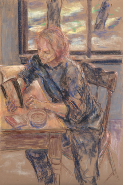
The first was done on a plain plate initially covered in goopy wet black printing ink. It's an exercise in removing the ink and mark making (a phrase that should really be banned for intelligent use). For want of a subject I just played on Dereck who was working at the same table (sorry Dereck!) since he was the sort of person I really enjoy drawing - someone completely absorbed in doing something.


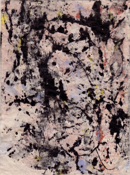
The next was done after a bit of coffee and a break, playing with drips, rollers, scrapers, and various odds and ends. The colour is oil paint and the black is printer's ink. Dan says there's too much black but I think there's just not enough deep red. I think the after effects of reading too much TJ Clark writing about Pollock is apparent.


The next one is sort of cool, it's a ghost print. When the plate is run through the press, most of the ink is transferred from the plate to the paper, but some remains. So you run it through again, using a very fine, dampened, Japanese paper instead of the heavier printing paper, and this is what comes off.


Given a bit of time, one of the great things about printing in general is that the image can be evolved. I love (for example) taking an etching plate, printing a few, re-etching, and doing the same again. More orderly types object to this - they want fixed editions with fixed numbers of runs and things numbered in nice sequences and the plates destroyed afterwards - but as far as I'm concerned, blech. That's for the anti-Darwinists of art. If doing things somewhat haphazardly was good enough for the greats like Rembrandt and Degas, well, who am I to complain.

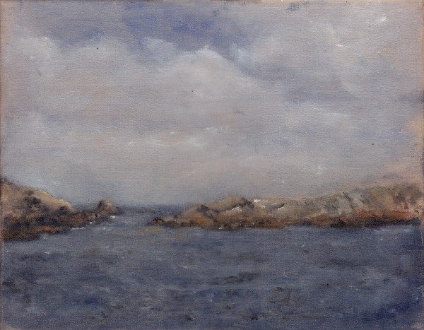
Monotyping really lends itself to this sort of approach. Take whatever pattern is on the plate and push it around a bit and see what comes out. This idea isn't new - Leonardo suggested taking stains on the wall etc. as starting points. Looking at the previous prints, Arlene saw the random one as more of a landscape when turned sideways, while for me in the orientation given I see more of something figurative. No surprise there, she has a better eye for composition than I do! But as I had the plate and the paints in my mitts (and she was 100 kilometers away), the figure won. Not that that is necessarily a good thing.

Friday, February 3, 2012

Lisa Writing


A new box of Sennelier pastels tends to lead to a bit of excess. The new box of Holbeins doesn't help....

Tuesday, January 3, 2012

Lisa, Reflectingly Wicked


As a bonus, there's this one done at the end of last year, before Lisa escaped the clutches of the university. I really spent waaaaay too much time on the hair (but I quite like it).